06.18
Featured Research
Building the Universal Menu of Tomorrow
––An Open Source Project, exploring what steps would be needed to overcome bias & shallow recommendations and a look into possible limiations in current - future ML/AI solutions. If you’d like to get a better idea of how all of this comes together I would recommend giving my article a read.
︎Medium Article
How can we make Food Meal Curation intelligent enough to manipulate any menu to match any situation & compensate for our varying palate, budget & diets?
a CURRENT LIMITATIONS
Impersonal & Shallow Recommendation, where learning is based on collaborative filtering and comparing items ordered vs. items viewed (Restaurants, Categories or food items themselves). Moreover, the most valuable information gained is only done so if and when an order is placed (and reviewed)
Decision Paralysis caused by long endlessly scrolling lists of (hundreds of) options, where the top positions are trying to decrease churn as much as possible
Business models are overly reliant on commission taken per order and only available on a single platform with limited CRM (Delivery, Take-Out, In-Restaurant, Groceries, etc.)
No understanding of how Context Affects the Users’ Choice
︎ Weather, Time of Day, Event/Occassion
︎ Variations amongst Short ︎ Long Term taste preferences
︎ Am I Eating Out? With Friends or Family (What do they like?)
︎ How does this specific meal affect my Health?
RESEARCHING THE SOLUTION
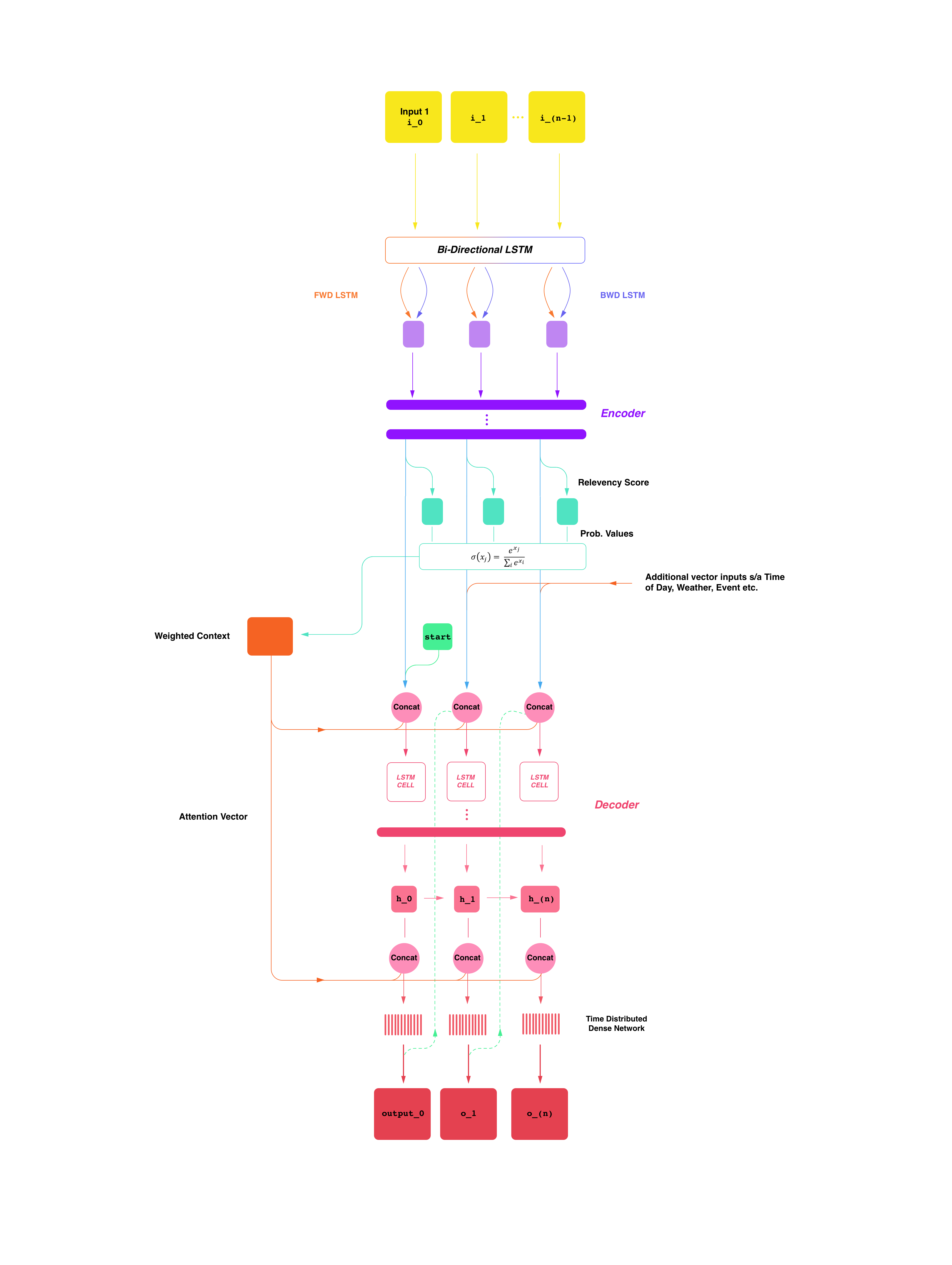
A Super Quick Summary: By presenting the user with dynamically created meals (meal cards are a combinations of items & customisations), the user can essentially A/B test for as long as they like before ever ordering their meal. When combined with Context, we can build a much deeper understanding of the variations of meals the user will enjoy at any time. When further combined with the breakdown of the meals into their base ingredients, we can begin to compare combinations across multiple restaurants, locales and platforms and overall create more finely-tuned suggestions for users. The holy grail would be then taking this unbias platform and applying it throughout an individuals’ life, helping a large and long term trend towards more informed and healthier diets.

So I’m not going to go into the business side of this in this post but it’s pretty apparent that business goals tend to dictate (to an extent) UX goals and hence UI design. This directly affects what interactions the user has with the app and eventually we are lead into a cycle, where data sets are only built around understanding which meal will be sold quickest (without the user leaving the app) and which ads they would be most likely to interact with.
Poor Business Goals ︎ Poor UI Design ︎ Poor Interactions ︎ Limited Data Sets ︎ Limited Artificial Intelligence
Instead, I wanted to understand what would be needed to create a personal food critic in your phone for any situation. Taking your likes, dislikes, diet, current context and more into account to curate the perfect meal.
In order to do this, I conducted studies to breakdown the thought processes we have when faced with the digital and print menus we interact with on a daily basis experience, trying to understand the changes and variations over time. I then looked at a variety of apps from traditional aggregation sites such as Just-Eat, on-demand platforms such as Uber Eats and Fast Food 2.0 apps, such as Blue Apron. I’m not going to lie, it’s sad that the biggest difference is the varying branding via colour palettes and typography...
I found that the majority of thought processes that drive an individuals decision was mainly based on their experience and the information at hand. This is most apparent when individuals tend to stick to similar items, or are specifically visiting a restaurant to try an item they’ve been recommended. However, it also raised a few problems where this decision making really does get overwhelming quite quickly, especially if it’s a restaurant you’ve never visited or seen the menu of before (imagine the difference between your go to fast food place vs. a high end restaurant where the whole menu is written in a foreign language).
Full breakdown of possible CRM + Delivery platform. HQ version on this page
Looking at User Applications, we can clearly see current platforms catering to this feeling of familiarity throughout their core elements, with slight aesthetic variations within their implementations of the now ubiquitous: Main Page, Deals/Ads, Search Area, Filter & Reminders to share the app with your friends for $5-10 in credit...Of all of these elements, the most important is easily the Main Page. It’s the first thing you see when you open the app and those first interactions will make or lose a potential sale. So if we really want to design something better with the correct goals, we should begin to understand how these things work past just the aesthetics.
How Do User Interactions Create/Influence Recommendations?
(shortened)
(shortened)
To begin, items on the home page (in the vast majority of cases, these are just restaurant listings) must be sorted and ranked. Traditionally, services would allow users to sort by Distance, Price, Rating (Score or Stars) and Popularity providing quick and easy ways to narrow down the options presented. However, more and more apps today are ranking restaurants according to Multi-Objective Optimisation Algorithms, where the aim is to display items that will be a balance between keeping users happy (with a restaurant/food item they may order from) and merchants happy (getting an order, more preferably one with larger profit margins). Other than this, services have employed their own algorithms to further integrate user data, highlighting trends they can then use to further influence what you see.
An Inspired Solution
Eventually, I was inspired by the goal oriented approach popularised through the use of Reinforcement Learning and even though I would be ignoring the fact that there was little to no data easily available (in current form) to back any of this up, I came up with what I called:
Meal Cards — A container comprised of what could begin with a decent guess of what a meal could be but, with the right tools could eventually learn to bring some order and sense to menus.


Here (above), I’ve tried to give an idea of how meal cards could further be grouped by different Scenarios; Breakfast, Sports Game, Night Out, Dining w/Family etc. & Food-based Themes.
Now when I was trying to put this into a design, I wanted to make the Home Page the absolute centrepiece of the entire app and have the user’s context drive what to display on it, whilst always keeping a consistent centre of navigation, with natural positioning of the complimentary sections of the entire app (Swiping up moves you to the section above, wherever you are; swiping back down should return you to your original position).
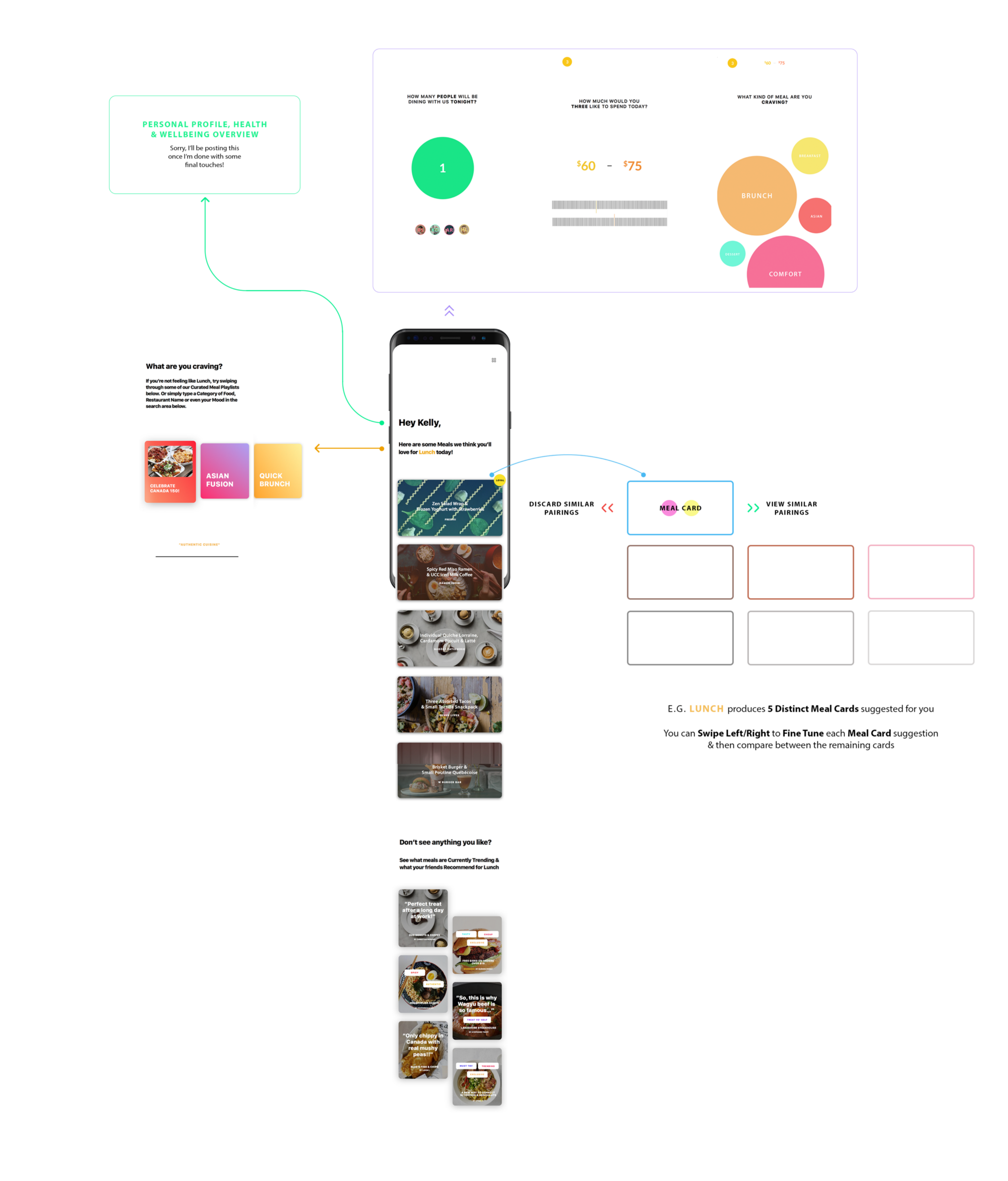
Home Page
“Hey User’s name” is a nice and friendly welcome to the app and will stay constant, allowing you to always click on your name to see an Overview (I talk more about this section below).
“Here are some meals we think you’ll love for Most Likely Scenario & Playlist today!” This section would adapt to your location, weather, time of day and try to suggest what type of meals you’d be interested in looking through right now. Moreover, you can tap on it and switch the suggestion for another one or search and find Meal Cards that fit in that parameter instead. Also, if you’re Dining-In it would only display meal cards that fall under the same scenario but from that specific restaurant.
Below this we would display n{1,2,3...} types of Meal Cards (composed of multiple suggested items) that fall under the Scenario (e.g Lunch) that you can swipe left if it’s unsuitable and you don’t want to see any more suggestions like this. Or swipe right if it’s good but not quite good enough. By n types of Meal cards, I essentially wanted to allow users to swipe within a specific lane of Meal Cards, where each lane n is composed of generally similar Meal Cards but with slight changes with the combinations (e.g t). Each lane will also be different, but all n lanes will fall under one shared Scenario. For example a single interaction within a lane could be seen as {n2t1 ︎ n2t2 + Current Context} where t is already a compound of suggestions based on context. Please note the use of colour in the diagrams above help make this notion much clearer.
Once, you’ve found a Meal Card you like you can hold down on it and complete the order with any additional modifications. We would then use these modifications to help autofill subsequent next Meal Cards.
Contextual Sorting (Playlists)
As described above, this section would bring together the most likely scenarios and themes of food you would interact with based on the time of day, weather and so on, as well as taking whether you’re dining in, picking up or ordering for delivery into account. They’re akin to Curated Playlists, composed of Meal Cards you can swipe through.
Power Search
Irregardless, of how the Home Page has adapted to your context (Scenario/Theme + Dining In, Picking Up or Ordering In) you can always swipe up to enter what I call the Power Search. Why the cheesy name? Well it allows a single or multiple users to combine their different taste preferences, budgets, current contexts, etc. together and use that to drive the curation of Meal Cards on the home page! Specifically, your history would dictate what would be on each of the three sections and allow you to the fine-tune it to your likings (The third page would be populated and weighted using a mix of your preferences as well as what’s currently popular).
The main aim for this section was to help individuals who quite literally have no idea what their stomach is telling them to eat, and for those moments when you’re in a group wishing you could read everyone else’s minds to help you decide what to actually order.
Health & Wellbeing Overview
By having a platform that allows use beyond a single scenario and is able to compose the meals themselves we’re able to help drive more than short term recommendations. In fact, if we allowed individuals to simply choose the level (maybe as simple as a scale from 0–3) of “healthiness” their long term diet should aim for, and allow users to catalogue meals they’ve eaten outside of our platform (through manual input, barcode scanning & taking pictures of their meals) we could create a connected meal planning, diet tracking & curation service in one. Moreover, such a system could solve a pretty big problem healthcare professionals face today in understanding the general eating habits and even cravings their patients with diabetes, hypertension, allergies, etc. have and find suitable meals when eating out and throughout their daily lives — it’s just too arduous today).
Why didn’t I post the design? Well because, I’m pretty sure I would rather offhand most of this to your centralised health app of choice, whether that’s Apple, Samsung or Google Health. The main aim would be providing these apps with the core information of what you’ve actually eaten and then have it work out how healthy you are and have been. We would then take that and your preferred long term goal and use that to drive Meal Card generation for you. It’s not like we’re ever going to have the same level of data on your actual health as they would. This would just be one part of the growing control we should all have over our health in the future.
Dashboard (for Merchants and really anyone in the future)

But Why Share All This?
The main reason for writing this, isn’t just to share my cool idea to make the experience of finding your next meal better in every way––It’s because after all my time researching, meeting & talking to entrepreneurs, designers, engineers and somehow managing to make it into the Next.ai finals without a team. It became clear to me that there’s not a lot of people who understand how to build with human goals at the heart of their businesses so...
We’re all royally fucked as everyone and their moms race to add AI to everything they can get their hands on.
And it’s not intentional at all. It’s just because no one really understands what’s going on and there’s even less people who understand how to design anything for users with them in mind. Which, makes sense seeing as recent reports state that there are as few as 22,000 people in the world who even understand the subject enough to create AI solutions for companies. Meanwhile on the design side of the world, we’re still debating whether the hamburger or tab bar is better for navigation, talking about how innovative it is to use gradients over mere solid colours and even our supposed saviours at Apple can’t seem to understand what a consistent design language is anymore…

And yes, I understand this case study is barely a breakdown of menus or food, it’s a shitty UI design/UX research overview and an even worse AI blog post. However, I really do believe it’s about time we start taking a step back to ensure we’re creating AI that’s truly serving us. Moreover, platforms such as this allow more than just one app allowing anyone to choose and even create their own an app that best suits their particular needs, instead of being forced to use the only one available because no one else could compete with their proprietary data. Or what’s more likely, the app that was simply the first to flood the market with coupons and deals and were able to ride out the huge losses to barely become the market lead in whichever locale they started in.
Even when talking about my idea itself, it may not be that important for anyone right now. I’m sure we’ll be able to walk into a restaurant and be given the standard printed menu we’ve come to expect, have a nice waiter ready to give us some advice and take our order. But, just as quickly as we saw ordering kiosks replacing human cashiers at McDonald’s, it won’t be long before everything will be replaced by a single tablet in the middle of the table.
But seriously, thank you so so much for reading this horrendously long post. It really means the absolute world to me and if you liked what you read, why not check out some of the shared resources below, and don’t forget to try out the prototype for yourself! And here’s a lil’ treat for those who managed to get through that.
︎Github
NOTA BENE: